Industry UI
Greetings space pharaohs.
As you may have heard by now, we are working on a complete player experience overhaul for Industry in 2014 and plan to release the first iteration of it this summer. To cover all the details we have six blogs lined up in relation to Industry:
- ✓ The first blog of this series tackled Reprocess all the things!, where we explained the overhaul to the reprocessing formula, skills, starbase reprocessing array and compression in general.
- ✓ Building better Worlds focused on manufacturing system changes, mainly damage per job, extra materials, slot removal and starbase improvements.
- ♥ Industry UI - In this blog CCP Arrow covers the extensive UX research we did to reinvent the Industry UI in EVE Online.
- Researching, the future - CCP Greyscale
- The price of change - CCP Greyscale
- Teams - CCP SoniClover
Industry Player Experience
To understand how we could improve the overall player experience of doing industry, we had to investigate how players use it currently and get to the root of the issues they were having with it through different use-cases and examples. We then looked at how it was initially intended to work and set specific goals for how we would take that initial idea and make it better by focusing on a few key elements. Here are those elements, what they mean and what we did to fulfill each of them:
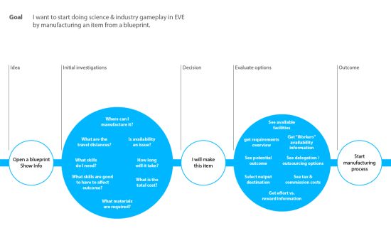
Discoverability of the feature is key
We wanted to make sure players could open up and view the Industry window from wherever they were in the game, from any location or at any stage, even during their first-ever play session. This will not just help new players get introduced to the feature; it will also help the industrialist who wants to investigate his ability to produce something before acquiring the materials for it, or anyone who wants to find a suitable location in which to do Industry before going through the logistics of doing so.
The Industry window will be available anywhere in New Eden, so even if you can’t start a specific job from your current location, nothing will stop you from visualizing it and making sure you have what you need before acquiring that lucrative blueprint you have been saving up for or before you take that long haul with your minerals to manufacture the next large war chest batch of ships.
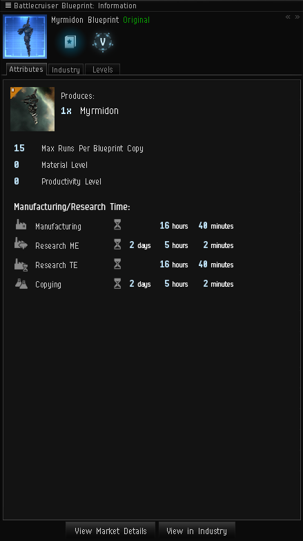
The Show Info for blueprints will get an overhaul in the same fashion as the Ship Show Info got when we released the ISIS (InterBus Ship Identification System). The Show Info header will display the skill requirements icon in the same manner as we did for ships, to allow you to see at a glance if you have trained all the required skills to use it. We plan on adding certificates for Industry as well, but it will be done in a later release after we have given players good time to digest the potential skill changes needed to do to make a solid hierarchy for Industry certificates.
The attributes tab for blueprints will be cleaned up and made more to the point where only the baseline information info is displayed. We want Show Info windows generally to show base stats only, which are the same for all players, but then show the end results of modified values in the appropriate interface -- in this case, the Industry window. That being said, research ME/TE will however show time for next level rather than an absolute time, which will then change depending on current research. We want base values when possible, but if we need to display it differently we will message it clearly in the UI. It also has the capability to be “finished” for fully researched blueprints. This is not the case with all Show Info windows today, but in the case of Industry, we had a chance to make this modification to guide all inquiries about end results into the actual window where the actions are taken.
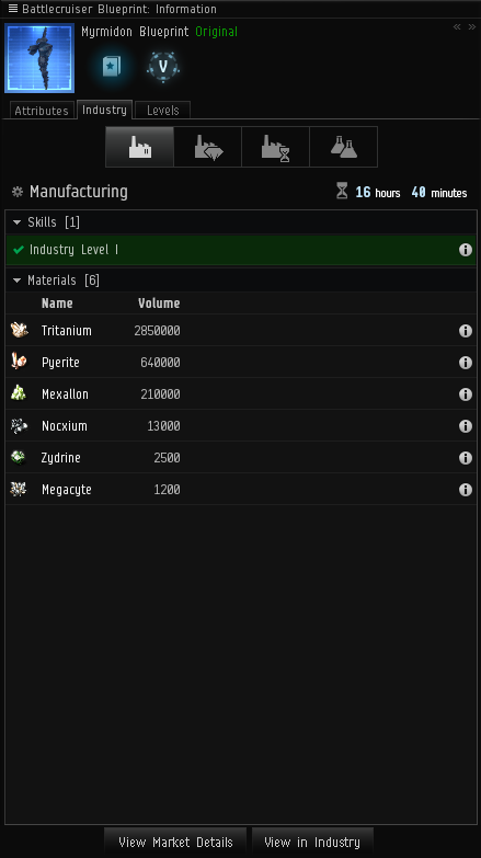
A new tab in the Show Info called simply “Industry” will have a visual selection menu in the same style as Certificates and Ship Masteries, where you navigate between the supported activities for each blueprint. You will be able to add a blueprint into the Industry window by simply double-clicking on it in the inventory, and there will also be an option for it in the right-click as well as at the bottom of the blueprint show info, “View in Industry”. Other improvements to skills and requirements will follow many of the visual updated we did for Ship Show Info windows.
Consistency across all Industry activities
We did some extensive investigation to check what type of Industry activities players were engaged in, and were able to group together the ones that made sense to have together. This would ensure players could start doing one of those activities and, without much effort, understand how the other activities work in the process.
(We realized that certain things could not be addressed this time around, like Planetary Interaction and Starbase reactions. That doesn't mean we won’t address them; we are just prioritizing things based on what fits together.)
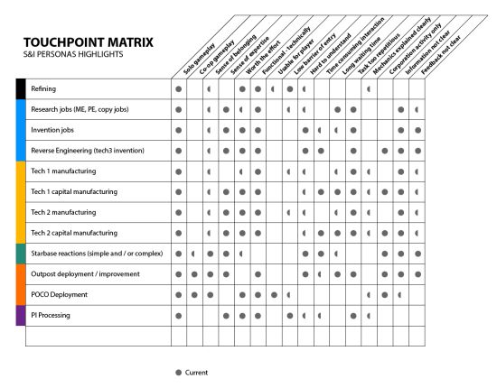
Our initial investigations based on the results of the Industry survey and other case studies showed that players saw a clear difference between certain Industry-related activities, while other activities seemed more similar even though the UI for them didn’t work the same. The matrix above showed how we mapped the current state of various industry activities before we started looking into what to modify.
We decided to group these industry activities:
- Manufacturing
- Research
- Invention
- Reverse Engineering
These activities shared the same characteristics when it came down to how we could improve their UX overall, and fit well together in terms of what our players consider part of using and managing blueprints. Refining, by contrast, was considered by players a separate thing from other core Industry activities, so we concluded that any improvements to refining would have a unique UI.
We did multiple passes investigating how players might do industry activities and always ended up thinking about blueprints. They are the heart of the process, so we decided to frame the core experience of the new Industry window around blueprints and helping players discover them more easily. We also wanted players to be able to “pre-visualize” in the Industry window at any time.
Interactions should be efficient and meaningful
Any interaction in the Industry UI should be a gameplay-related decision done by the player instead of the player farming through confirmation windows and checkboxes. We wanted to strip out any unnecessary interaction unless it had specific purpose for the task at hand, whether that is changing actual input materials or output destination or simply adding more runs to a job. We added multiple ways to efficiently add count on runs (using keyboard shortcuts or direct manipulation on a value slider around the selected blueprint). Speed was another important factor and players will be able to start jobs super quickly and get instant updates on values when tinkering with job runs.
With each feature we’ve been working on, we aim to make the UI as efficient as possible to use. This doesn’t mean we are dumbing down EVE in any way: complexity in gameplay should never be tied to how well our players know how to navigate the UI.
Allow players to learn by doing through clear feedback
We wanted very clear feedback on all elements in the UI, explaining expected or potential outcome when hovering anything that can be interacted with. We also aim to provide clear messages when states or processes would change.
We also knew that although we are making it easier for players to learn by doing, we would not be eliminating all wiki pages and third-party tools dedicated to Industry. Our focus was to allow players to get a good fundamental grasp of the gameplay of Industry and clarify the basics in the UI. But if players want to become masters of the craft, they would need to do some good old reading, as with anything worth mastering in general. Reading is still fun. And cool.
Make information readable and enjoyable using graphical representation
Using the same mantra we used when developing the ISIS feature, we wanted information to be represented in a graphical manner, making it readable at a glance and making Industry activities more enjoyable to do overall. Of course not all things are better represented using visualizations (there is a reason why people prefer spreadsheets for some things). Thus core navigation for things like selecting blueprints or installations will remain in a list view, because that is the most efficient way to navigate, compare, and finally select the one you want. That doesn’t mean we can’t make those lists better both functionally and visually -- which we of course went ahead and did.
Making these improvements also meant making sure all the important information and interaction options would exist in the same view, eliminating the need for multiple steps and windows. This did mean we had to make the default window for Industry larger than most other windows, but the benefits definitely outweigh the downsides, which was that all activities could be monitored and interacted with within that one window. We ensured the window could be used in even the smallest supported resolutions, even though it wouldn’t leave space for other interactions. This was still a bigger benefit than forcing the Industry UI into its own full screen view.
Picking the right visualization style and pattern
Whenever we need to supply the player with a visualization to explain a system or concept in the game, we need to investigate what information needs to be displayed and presented clearly and then choose the visualization style that fits the needs. There are many common visualization styles available to pick from and we studied most of them, evaluating the pros and cons of each.
We ended up choosing a combination of styles to represent the visualization, picking the bits that suited best from each. We also decided on a traditional list view below it for selecting blueprints and installations and to manage the jobs and teams working on them.
Prototyping
Once we knew what kind of visualization we wanted, we started working on prototypes to ensure the flow of actions would make sense and that information would be readable at a glance and always give the important information while making sure the screen would not become too cluttered.
An early prototype wireframe:
Designing the Industry window
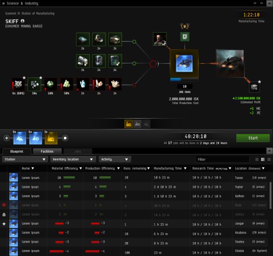
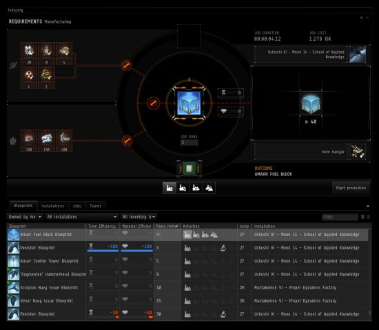
Once we had taken the wireframe seen above through multiple iterations of design, art concepting and art direction, we ended up with this:
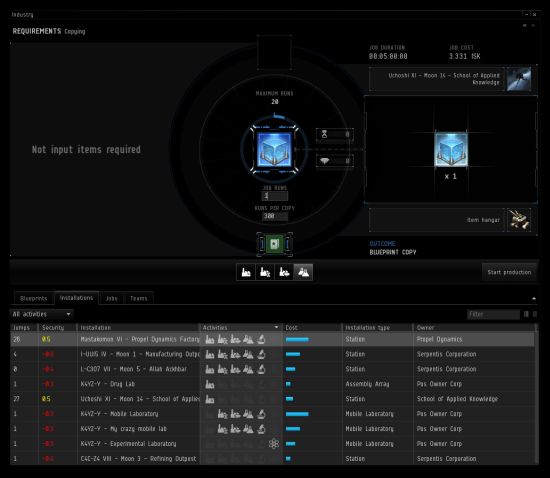
We already teased you with this mockup in our last blog Building better Worlds, but now we will go into the details of what is happening here.
Input requirements
When you drag a blueprint into the visualization area, inputs will automatically be added from the default input location of the installation where the blueprint is located. The default input location is your hangar floor (root) if it's a personal job, or the corporation division where the corporate blueprint is located if it's a corporation job. The input requirements area will have clear distinctions between items that are missing and those where the quota has been met.
When you first drag a blueprint in, the job runs will automatically go up to the maximum amount you can do based on the amount of required items you have; if you don't have enough items for one or more groups, the runs amount will go to 1. You can then easily change the number using arrow keys, mouse scrolling, or direct manipulation on the value slider.
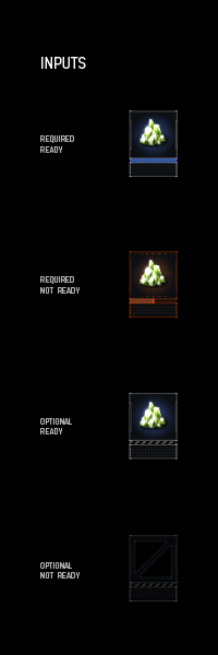
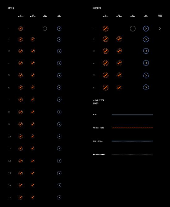
The connection lines will have sections that map to the number of input types in each group. Those connection lines will also have state icons for Ready and Not Ready states and the lines themselves will also have clear indicators of the ready or not ready state of everything beneath it. There is one indicator icon for each group and a single larger one that represents all groups.
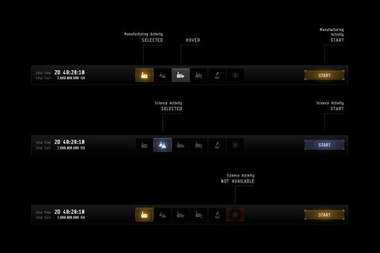
To follow through on our goal of making the interface readable with the small screen real estate we had, we knew we had to create icons to represent certain key elements. First off we designed icons for all the Industry activities, making a clear visual separation between Manufacturing activity and the other Science related activities. Manufacturing got a yellow/orange theme and appropriate ambient and UI sounds from an industrial setting. Science activities got a blue tint with more technical and scientific themed ambient and UI sounds. These icons would be used everywhere in the client where we reference these Industry activities.
We also created new groups for requirements to help players identify what requirements are tied together and share the same source location or purpose, doing what we did with the new ship group icons for the ISIS. These groups could then be used to categorize these different items in the game to help players identify them quicker.
The Heart of the window
Blueprint selection, as well as visualizing requirements, volume and outcome of blueprints, will be the core function of the window. For that reason we wanted blueprints to be at the center of the interface and be the first thing players interact with when opening the window. Different states depending on the availability or type of activity will be displayed with relevant effects (visuals and audio) for each unique blueprint.
If the blueprint can't be used for some reason -- perhaps you don't actually own it -- the blueprint slot will have a Not Ready state. If the activity is manufacturing, the look and feel will be yellow/orange, while all Science related activities will have a blue theme.
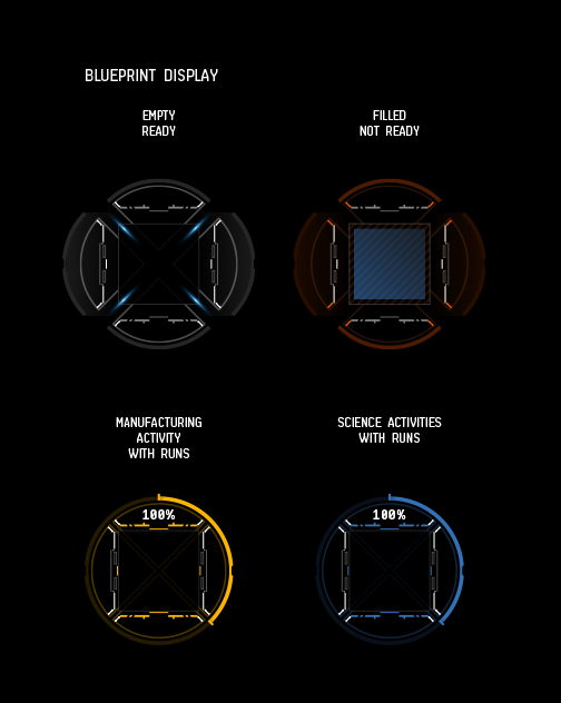
Mockup showing different states and activity modes for blueprint input UI element
Empty State
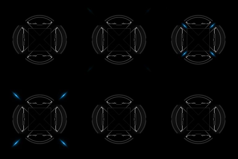
Unavailable State
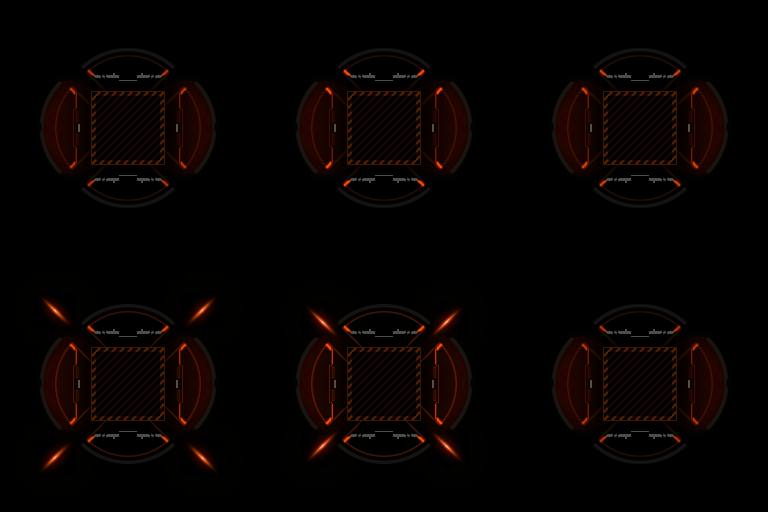
Players can drag any blueprint into the visualization (even the ones they see on the market) without owning it in order to visualize it in the window. If the blueprint is not actually available, this state will be shown.
Activity selection
When you select a blueprint, it will automatically select the first available activity the first time you do it. After that it will always use the one you had selected in the previous setup. You can also select an activity directly from the blueprint list. If an activity is not available for a specific bueprint, it will be indicated with a specific Not available state.
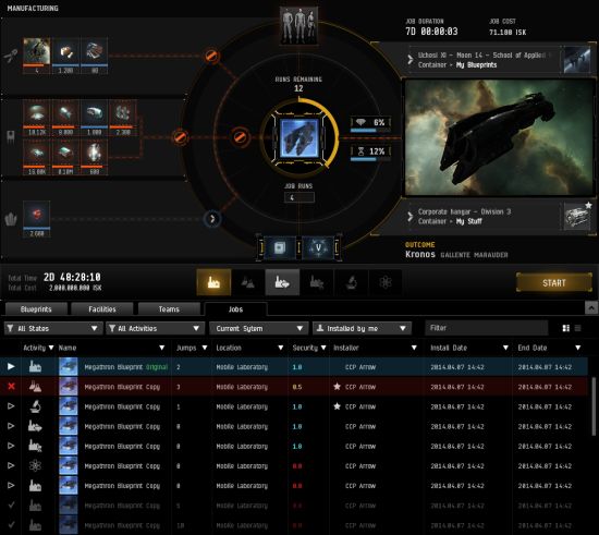
Jobs tab
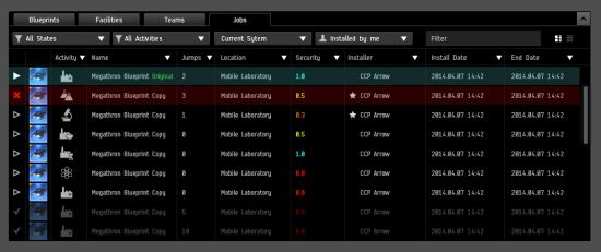
Once you have added a blueprint into the visualization area and met all the requirements, you will be able to start the job. Once the job starts it will be added to the Jobs tab with an active state and will be moved to the top of the list.
Job states
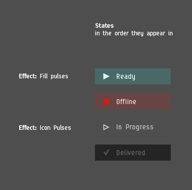
Jobs will have different states, and are sorted by default in the order displayed above. Once a job is done, you will get a notification in the notification system that a job is ready for delivery. You then click the Deliver button in the Industry window and get the bacon!
Filters
Each tab will have filters available to help those that have massive jobs lists. Jobs up to three months old will persist in the list. The job tab will have a specific default state, but will persist to the selection you pick once you have changed it.
Blueprints Tab
Apart from being visually different than BPC (Blueprint Copy), a BPO (Blueprint Original) will have an infinite sign in the "Runs" column.
Filtering the blueprints by their inventory location will now be possible, allowing you to include corporation divisions and station containers. \o/
Installations Tab
Each installation will display the activities it supports. Security status is now displayed directly in the list.
Installation and Destination
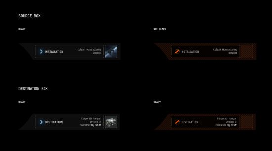
The installation gets picked automatically when you select a blueprint. It will select the installation where the blueprint is located and use a default location for inputs. If you used a personal blueprint the default location is your hangar floor (root) but if you picked a corporation blueprint you get the first available division of the corporation in the installation where the blueprint is located. You will be able to change the input location for required items by clicking on the installation frame and pick, for example, a specific container.
For destination, you will get the same defaults and will be able to pick a new one, a specific container, different division, basically any inventory location you have access to within the installation where the blueprint is located.
ME & TE (formerly known as PE)
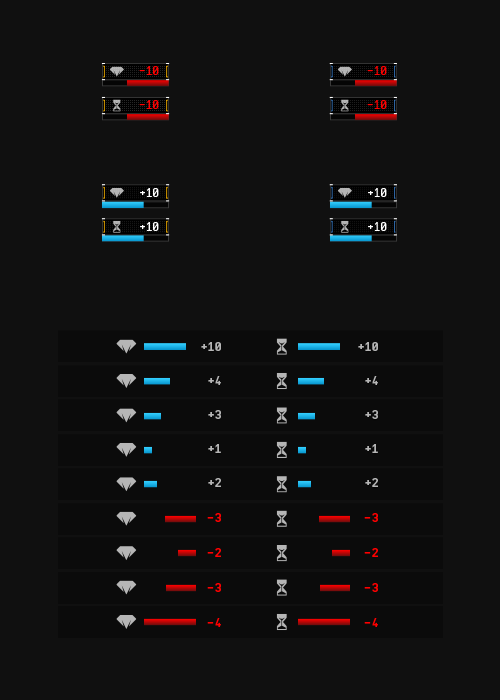
For ME (Material Efficiency) and TE (Time Efficiency) visualization we will have two specific boxes to display it next to the blueprint that will be hard to miss. We use values, color and bars to represent the values to make them easily readable at a glance. Positive values will have a bar growing from left to right and negatives will go from right to left. This will save more horizontal screen space than using traditional center split bars. Since we display the values with + or - as well as color it should still be very clear. CCP Greyscale will go into more details in his blog regarding ME and TE.
Reverse Engineering and Invention
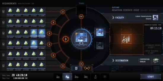
For Reverse Engineering and Invention activities, we have slightly different feedback and interaction requirements in the UI. The core interactions however stay the same across all activities to ensure functional consistency. Once you have tried one activity, you pretty much know how to do all of them.
Quality meter
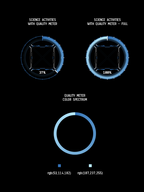
The quality meter around blueprints that are being reverse engineered or invented will determine the potential quality of the outcome. The % value will go up if the player adds optional input items or trains skills that affect the job.
Optional inputs

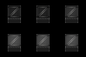
Left side: Default state for empty optional input slot
Right side: Hover effect
Select the outcome
Work in progress mockup for Reverse Engineering and Invention activities visualization
Teams
The mockups show a tab called Teams as well as an icon above the blueprint in the visualization. I will not go into it in any details in this blog because we have a specific blog lined up for it from CCP SoniClover, so stay tuned for that!
That's it everyone. We promised to release the Indy blogs before Fanfest so that we could be gathering feedback on the designs rather than spending the time filling you in. We will monitor the feedback on the forums as well as we can, but replies might not be as structured as usual (because of Fanfest). We will read every single post so please give us your thoughts, be constructive and send us positive vibes along with your feedback.
I hope to see you all at Fanfest so that you can show up to our Industry Panel and Roundtables and just come up to us directly and have a chat about Industry. We have been working very hard on this feature and want to make it the best it can be and that can only happen with your guidance and support.

