News from the fontlines
Ola!
I'm CCP Punkturis of Team BFF and I'm here to talk about font changes. Yup you heard me F O N T changes!
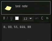
I know you have all had problems with differentiating between I1, O0, 5S, 6G&, 8B and I don't blame you:

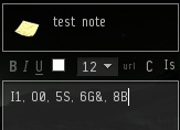
So let me present Eve Sans Neue, where you can see the difference between letters:

We’re still tuning this, don’t worry if some screenshots look a bit wonky right now. The font is, for example, sitting a bit too high at the moment so it seems like there’s not enough space above it at times, but that will be fixed.
All about it
Eve Sans Neue is a refinement of the original Eve Sans font. The design was revised, it was technically updated and readability has been improved. Among other updates, it now contains native Cyrillic characters, different fonts for different size groups, and a rounder form that improves legibility.
To get the new font to render the best we could we had to update our version of FreeType. While we were at it, we decided to change our approach of using FreeType slightly and move more of the work into C++, rather than Python. This results in a significant speed boost in text rendering, meaning we spend less time opening up new windows in EVE. We've also changed how we handle characters that don't exist in our font. We used to search through your Windows Fonts folder for some preferred fallback fonts, then failing that, searching for the font with the most characters in it. Now we've simply licensed the Arial Unicode font and provide that with the EVE client, using it to render any characters not available in the EVE font.
Label styles
We didn’t have much consistency in the way we displayed labels. So to make the look of EVE more consistent we created just a few label styles and applied those to the existing labels. That means some of the text will be smaller than it was before, and some will be larger. This also means that maintaining the labels and making style changes in the future will be a walk in the park.
"I DON'T TYPE IN CAPS CAUSE I'M MAD I TYPE IN CAPS BECAUSE I'M LAZY!!!" - Kanye West
EVE was full of uppercase labels. I kind of felt sometimes like the client was screaming at me; anyone else feel the same? So we removed a lot of the uppercasing. It's our opinion that the text is more readable now.
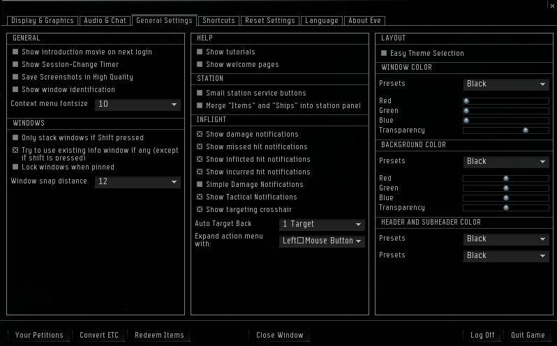
A good example of this is the esc menu. Here's how it was before:

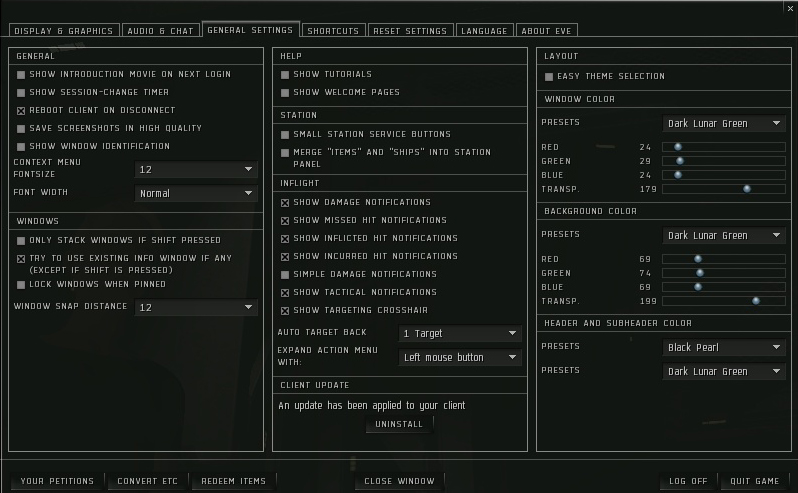
And here's how it is now:

I know this is quite a lot of change in something that many of you spend a lot of time staring at so it's probably going to take some time getting used to. Some people at the office thought it was a bit wonky at first but quickly started to like it.
Try it out and post!
Since there are endless things you guys do in EVE and we have probably not covered all of the use cases, we want to ask you to try it out on Singularity (real soon) and then report all issues in this thread.
Let us know if you find text that doesn't fit in windows, let us know if you notice that the wrong font is being used. Let us know if you see anything you don't like! Try typing in the chat and see if the correct font is being used (especially you guys who type in "weird" languages - I'm Icelandic and I consider Icelandic not weird).
Note that this is still work in progress!
We will be monitoring this thread and we'll try to get to things as quickly as possible.
I really hope this change is going to make life easier and EVE more readable for you all,
Thank you for listening!

