February Release - Changes Coming The Neocom Menu
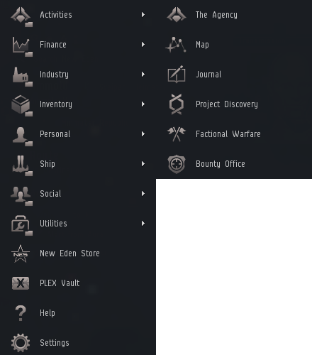
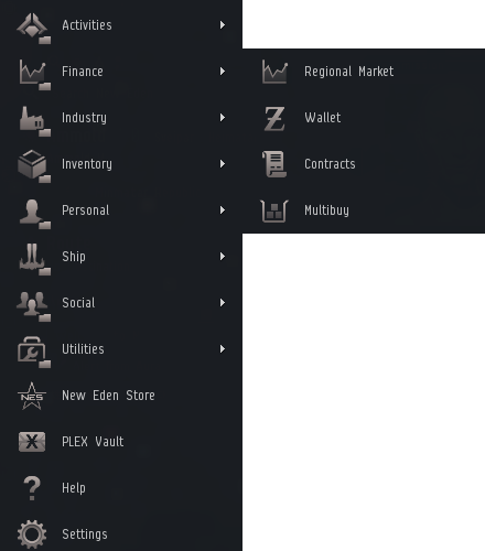
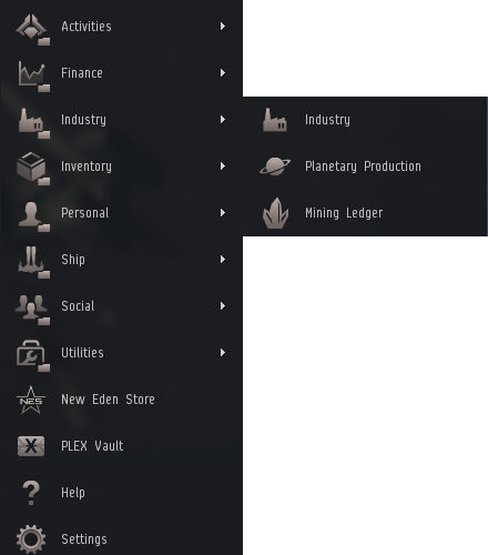
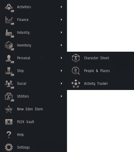
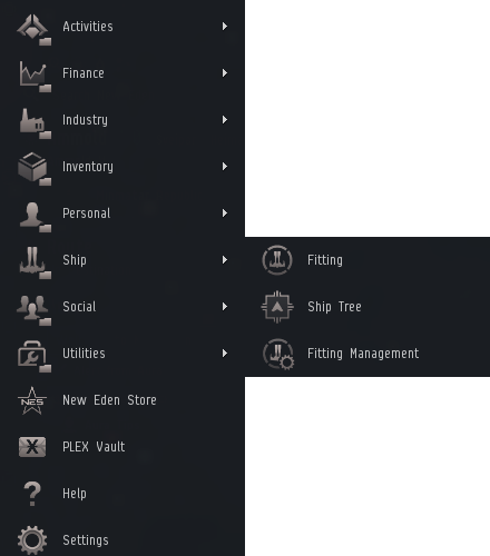
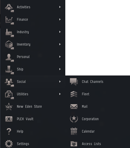
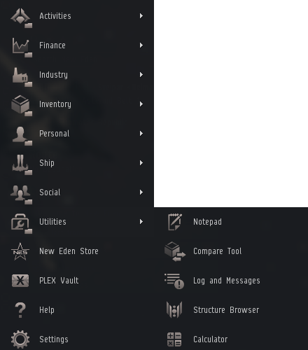
With the February release, we’ll be making some changes to the folder structure of the Neocom menu with the aim of making it more accessible and easier to navigate for new pilots.
Here's a short blog and a selection of images that details these changes!
After looking at usage metrics, it became apparent that there was a need to establish a clearer set of folders relevant to activities in EVE, as well as reducing the number of unanchored icons (icons that are outside any folder).
To do this, we took a few factors into consideration, including the most commonly used windows in the client and the most popular activities in New Eden.
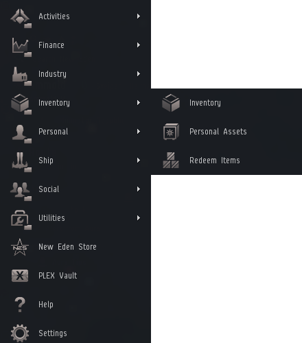
In addition to the changes we're making to folder structure, we’ll also be consolidating the different hangar options, as these having been confusing new pilots. The “holds and bays”, “open item hangar” and “open ship hangar” menu options will be retired with the February release.
Fear not, however, as these options are still available through the inventory window once you open it.
With the February release, we’ll also be reducing the number of default icons that appear on the Neocom Quick Access Bar. This is primarily driven by the need to reduce cognitive overload for new pilots. Our on-boarding team will continue to make changes as appropriate to cater for the needs of new players. Don’t be alarmed however, this should not change your current state. It will only affect newly created characters!
While these changes will affect the folder system within the Neocom, they will have minimal effect on the Quick Access Bar itself. When the February release is deployed, there should be no changes to any quick access icons that you have set up in your client, other than the removal of hangar icons that have had their menu option retired.
Below is a quick look at the new layout for the Neocom menu, and it’s also available for testing now on Singularity if you’d like to try it out. As we go forward, we’ll be looking into more holistic solutions as to how pilots can pin windows to their Neocom Quick Access Bar.
As always, if you have any feedback on these changes, feel free to post in the comments thread for this devblog.
We hope you'll find the new Neocom menu more tidy and useful!
