February Release - More Little Things!

Hi spacefriends!
As many of you know, for a while now we have been collecting ideas and suggestions for small changes that would improve the quality of your everyday EVE lives. While the work on this is a continuous effort throughout the year, we release a lot of the little things in batches and now in February it's time to deliver such a batch.
We have a long running forum thread where we encourage you to post your little things ideas (please follow the suggested format!), but this time around, a lot of the little things we are introducing were highlighted to us at EVE Vegas last fall. There we had many informal discussions with you guys where you brought up your ideas and we also held a Little Things roundtable where we discussed such improvements and collected index cards with your suggestions.
In this blog we want to walk you through some of the changes we are introducing now in February, and then go over some of the changes we released in a huge batch last September, which have not been covered in a devblog before.
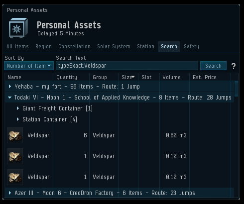
One feature that has been very frequently requested is to be able to be able to quickly search for a specific item type in your Personal Assets, and our response has usually been "Yeah, that would make sense". So that being brought up once again at Vegas was a nice kick in the butt to finally get that done. After the next patch is released, you'll have a new right click option on item types, "Find in Personal Assets", which will open the Personal Asset window, perform the search for you and as a result, list all the places where you own said item type.
Along with this comes the new search keyword "typeExact", which allows you to search for items with that exact type name. For example, searching for "typeExact: Veldspar" will only return you the Veldspar items, while using the existing keyword "type", "type: Veldspar" will return you any item types that have Veldspar in their names, such as Dense Veldspar and Veldspar Reprocessing.
As with many input fields in EVE, you can drag items into that search field. We have now changed that so when you drag an item in the Asset Search, they keyword "typeExact" is added, so when the search is performed, it will only return you the items of the same item type as the one you dragged into the search field.
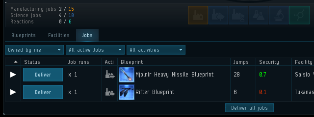
At our roundtable in EVE Vegas, an Industrialist, who freely admitted that his situation we probably rather unique with his 150 industry characters, asked for a summary of all of the character's jobs when opening the Industry window so he could tell at a glance if he had job slots free. While his situation is a unique one, that kind of summary would benefit most of us doing any kind of industry work, so we are happy to add that.
We have a lot of search and filter fields in EVE, and while many of them allow things to be dragged and dropped into them, not all do. We’re huge fans of drag & drop and apparently, we’re not alone as quite a few of you have been asking for the ability to drop things into those fields. We went through a lot of the edit fields in EVE and added the ability to drag and drop items, characters, corporations or alliances in them, depending on context. For example, characters can now be dropped in the Guest tab, corporation application filter and contacts list, and items can be dropped in filters in the Fitting window and the Industry window. There are still a few fields that we have yet to tackle, so please let us know if you favorite one is missing the awesomeness of drag & drop!
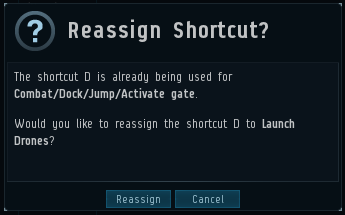
Those of you who have assigned shortcuts in EVE (and by the way, you can assign shortcuts to A LOT of things) might know the frustration when your preferred shortcut is already taken, and you are asked to clear it manually before continuing. We are streamlining that experience, and instead now you will be told that key combination is in use and are offered to rebind it to your new shortcut.
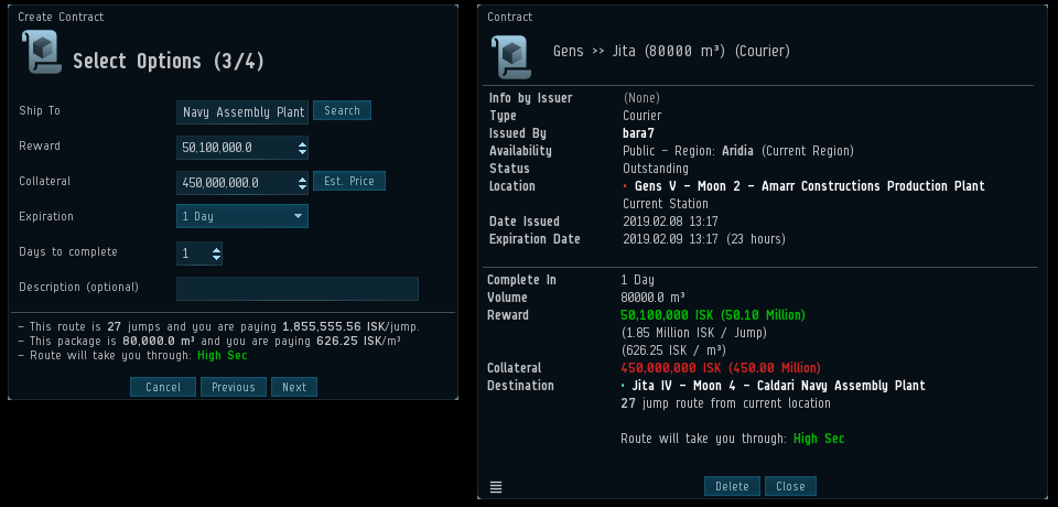
You requested and thus we are adding a display of the total item volume on the 3rd page of the Courier contract creation, the page where the destination and rewards are specified. For those who rarely create courier contracts or have fantastic memory, it might not sound like a big deal, but for us forgetful people, this will save us quite a few trips back to the previous page to see that volume number when we are trying to figure out how much we should be paying as rewards.
On this page of the contact creation window we are also displaying how much ISK you will be paying per m3, based on your inserted reward and we hope that will help those of you who use player run shipping services that charge based on volume.
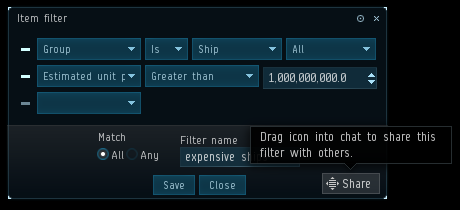
The inventory in EVE allows you to set up powerful filters to control what is visible in the inventory at a given time. Some of you have set up very extensive and elegant filters but have requested the ability to be able to allow more people to benefit from your work by sharing the inventory filters with your friends and alts. We want to help with that, so we are adding a way to share them. In order to share a filter with your friends, you open the filter's window by clicking "Edit", then you proceed to drag the special box to any text field, such as chat or the notepad. After that, anyone who clicks that link will load up a window which will allow them to save that filter for their character.
Similarly, we are adding the ability to share Fleet Broadcast Settings. You will now be able to share your broadcast settings with friends, or create links with your broadcast settings presets, which will, for example, allow you to easily switch from your dps settings to your logi settings.
A few years ago, we added the first type of settings links when we introduced the ability to share Overview Profiles through links. With the addition of the 2 new settings links mentioned above and a new special link we are working on (more on that at a later date), we thought it was good time to add a way to quickly distinguish the links type. We have divided the links into a few groups, and each group has its own link color. Most of the links will fall under the default link color and remain unchanged apart from a slight change in the mouseover color. Below you can see the new color scheme. The links will of course still have the tooltips to tell you what they do so you will not have to rely entirely on link color.
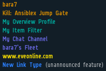
And because I know a few of you might be panicking right about now, I just want to reassure you that you can still El'Miner each other, but tricking people into joining that busy chat when they think they are opening a killreport might be a little trickier now that the channel link has a different color.
A request we have frequently heard is that you want to be able to filter Cynosural Fields separately from other beacons in your custom Overviews. While moving them to their own group is in theory straight forward, what complicates matters is that a lot of you have custom Overview Profiles that do not include the new group. Without special preparation the Cynosural Fields would therefore not appear on your Overview after the change. To combat this we started preparing early for this change by adding the new group, with the temporary name “Future Home of Cyno Fields”, to the Overview filters in December, which has given you ample time to update your Overview Profiles and shared Overview packs to be updated. In the upcoming February release, we will finalize the change by moving the Cynosural Fields into the new group, which will be renamed to be simply called “Cynosural Fields“.
But wait, there's more!
In addition to all those, we have a few more of your suggestions implemented:
- A filter field has been added to the "Show Contents" window.
- An estimated price and item count has been added to the Cargo scan window.
- We have added 2 bigger fonts sizes to choose from for the Context Menu (set in ESC>General Settings).
- A yellow warning marker (!) has been added in front of those options that player might want to use with a bit of caution.
- A Health readout has been added to the tooltip for your drones.
- The Assist and Guard menus for drones will now only list the pilots on your grid, since the drones cannot be assigned to those off-grid.
- The "Mine Repeatedly" function for drones is now simply called "Mine" and the single mining cycle option has been removed.
- The ability to Copy/Paste from the "Jobs" tab in the Industry window has been added.
Previously Introduced Little Things!
As mentioned above, we also want to tell you about some changes we delivered to you the September release, so here we go!
One very common request throughout the years has been to allow modules in cargo to be included in saved fits. In a world where mobile depots exist, it’s gotten to be pretty fair to say these modules are actually a part of the fit. We have been open to this for a while, but what has stopped us in the past was the low character limit in the chat as the fits would be truncated if the links and fit information would exceed the limit. The new chat system introduced last year has a much higher character limit, so we were happy to finally be able to include modules in cargo hold in the saved fits.
Another thing commonly requested feature has been to be able to update fits and we added a way to do that last September. Saving a fit with the same name as an existing fit will now override the existing fit with the new one. So to update a fit, simply load it up in simulation mode, make your adjustments and then save the fit with the same name.
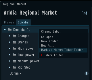
When we added the Market ticker a last year, a lot of you wanted to have some control over it, so we added the ability to specify a Quickbar folder that control what is displayed in the Market Ticker. Simply right click on your folder in the Quickbar and select “Mark as Market Ticker Folder” and the Market Ticker will show the market information for the items in that folder.
Other notable little things you asked for which were introduced in September:
- A “last saved” timestamp has been added in the tooltip for the fit in the fitting window
- If you fail to fit all items when fitting from the Fitting Management window or a standalone fit window, you are now offered to open Multibuy for the items.
- If you save or share a fit while having drones launched, the fit will now include those drones.
- Fitted ships in contracts can now be directly simulated from a right click menu on the ship.
- View Market Details has been added to the simulated cargo items as well as drone and fighter bay items.
- Multibuy has been added to the Neocom menu (under the Finance folder) and the ability to assign a shortcut to that window has also been added.
- You can now activate multiple skin licenses at a time.
- Skins are now grouped by name in the Character sheet (rather than material), which will reduce the number of groups.
- Ships listed under each skin in the Character sheet now have a magnifying glass so you can easily preview the skins and access the buttons to acquire them.
- Text that summarizes how many Skins you have has been added to the top of the Skin panel in the Character sheet.
- The skin tab in the info window for a ship will now show a check mark for the skins you own and list them first, followed by the rest of the skins.
- The skin tab in the info window for a ship will has been flattened out, rather than each skin being in its own collapsible group.
- “Estimated Price” column has been added to the Compare tool.
- “Dock/Jump/Activate Gate” hotkey now works on wormholes.
- The message telling you are not in fleet when you activate a fleet shortcut is no longer modal and should be less disruptive now.
- The tooltip on skills in the Character sheet now includes how many skillpoints you will train per minute for that skill, given your current attributes.
- A shortcut has been added to allow for collapsing all the windows. It can be found under Esc> Windows> Toggle collapse all windows. This is the functionality that a few years ago was bound to the Tab key.
- Ctrl+Tab now cycles through the windows in the order of Most recently active to Least recently active, instead of ordering the window by when they were opened.
- The entries in Tab Presets > Tab Types in the Overview settings now show the brackets for the groups (if possible) to help with identification.
- The systems in the Sovereignty tab in the info window for Constellations are now alphabetically sorted.
- Structure type, Services and Low Power filters have been added to the My Structures tab in the Structure Browser.
If you have new suggestions, please head over to the little things thread and share your thoughts!
Thanks it for now,
Fly safe! o7
